The System 809: Deprecating

This is one of those ideas that I wrote down, forgot I wrote down, then laughed at when I saw it later. The note just said:
Self deprecating / deprecating website
So, there ya go. See also… The System 588: Responsive Web Design
See More Posts About:
- Image Link Code:
- A link to this post:
- Tweet
- StumbleUpon

The System 795: Project Boxes

- Image Link Code:
- A link to this post:
- Tweet
- StumbleUpon
Well this is adorable.
One of my goals for the new year is to update more. More comics, more news, and more blog posts, too. So, to start things off, here’s something neato I found. Remember I used to post stuff like that? I did. It happened. Here’s a bunch if you want to look through. Anyway, here’s one more.

Tiny PMS Match is a mostly-photo blog (on Tumblr) where graphic designer Inka Mathew takes tiny things like berries, individual M&Ms, what my mom would refer to as “tchotkes”, and whatever other things she finds and then perfectly matches them with a Pantone Matching System (yes, THAT PMS) color. The result is fun and pretty adorable.
See More Posts About:
- A link to this post:
- Tweet
- StumbleUpon
The System 724: How Are Websites Made?

Originally written/posted on Medium.com here. This week’s post can be found:
See More Posts About:
- Image Link Code:
- A link to this post:
- Tweet
- StumbleUpon
The System 704: Designers Are…

(You can buy this as an 11×17 poster from my online store here.)
When I was teaching Intro to Graphic Design, I would give a speech very similar to this comic. A lot of times people use a pencil to represent graphic designers (because we’re creative? We write things sometimes?), but I think this is a better analogy. Designers use creativity, but we are precise and analytical and, well, all the other things I mention in this chart.
Consider this my ode to designers.
A lot of times (especially lately) people have asked me what designers do. Or rather, assumed what designers do. Here’s what we don’t do:
- Sit on our asses until an idea strikes.
- Play around all day.
- Make things just look pretty.
- Throw things together.
We actually:
- Consider the best solution to problems.
- Edit content to better make a point.
- Edit a layout to better emphasize content.
- Wonder how to best reach the goals of a project.
- Think about how one change may have 1,000 ramifications to other moving pieces of the project.
- Research what tools can best get the job done.
- Pay attention to every detail of the final result.
I’m sure I missed some. Help me fill them in the comments.

- Image Link Code:
- A link to this post:
- Tweet
- StumbleUpon
The System 655: The Sincerest Form of Forgery

- Image Link Code:
- A link to this post:
- Tweet
- StumbleUpon
One for the designers…

- A link to this post:
- Tweet
- StumbleUpon
New Handicapped Icon in NYC

A while back I did an explanation on wheelchair icons, and some information on a new icon that was starting to appear across the US. (Check it out below the comic here.) TLDR: The old icon implies a level of inactivity in the handicapped that isn’t that great, a new icon that is more “active” is a much better idea.
A group of academics are looking to change the handicapped icon on a grander scale, working to get New York City to adopt the new symbol you see above. The story starts as a guerilla marketing campaign and grows into a full-blown movement. An interesting read.
See More Posts About:
- A link to this post:
- Tweet
- StumbleUpon
Today’s Google Doodle
Don’t worry. I saw it.
Today’s Google Doodle (when they change the main image on Google.com?) is in honor of Saul Bass’ 93rd birthday. Saul Bass was an amazing graphic designer who also worked on movie title sequences (as well as posters for) many films, including many Alfred Hitchcock films. Or, to put it another way, you know that poster behind Wilson’s desk in House?
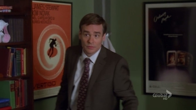
Saul Bass.
If you want to read more about Saul Bass’ career start with his Wikipedia page. And you may also want to check out this listing of all the Google Doodles and their history, it’s an interesting read.
See More Posts About:
- A link to this post:
- Tweet
- StumbleUpon
Under-Pantones

This is like a real-life cheese that I would have written.
Systemic Rebecca sent me news of undies for the designer in us all. Underpants by Pantone color matching system. But what happens when you wash them a ton and the color fades, do they go from 382C to 382U?
This also may be a great time to encourage designers to hook up with each other, just so someone around you appreciates the reference. There’s a “color bridge” joke in there somewhere.
See More Posts About:
- A link to this post:
- Tweet
- StumbleUpon
Comments: