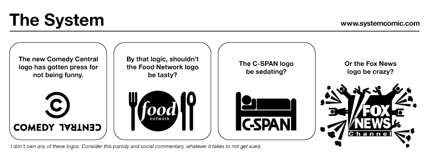
The System 447: On Redesigns

It’s true, Comedy Central has a new logo that they revealed the other day (thanks to Marty for the link!) and will be going live in January. A very many blogs have been picking on this logo for being too boring for such a funny network, looking too much like the Chanel logo, and just not being that interesting. And, of course, the similarity to the copyright symbol.
One thing is for sure, this logo lends itself much more to being a simple and clear logo. In an age of swooshes and 3-D messes for logos, I for one am excited to see something look so clean with a slight visual wit. Of course it will be rare that this logo sits still. It will be on screen, on web, etc. and in that context it will have its chance to really shine. I think those haters will be turning tides. I mean, come on. This isn’t the Gap logo. This is clear and a refinement of what came before.
Btw, how has nobody made the obvious reference? Comedy Central is going to build Robocop. Check out the OCP logo:


Comments: