The System 435: Ultimate Alliance

Solidarity.
A Quick Note About Wheelchair Icons
Btw, thanks to @aidensdame on Twitter for helping me track down the new wheelchair symbol. I had seen it around and thought it was a much better representation than the original “handicapped” one. A quick comparison:

Check out the old one. The person stands out from the rest of the style of this “bathroom icon” set that you see in the comic. The head is connected to the body. The arm / arm of the chair is straight and not curved on the end.
Then there’s the more symbolic element, “what does this symbol say about those in wheelchairs?” The old one implies a lack of movement or ability, as the person is neither moving themselves or seemingly able to do so. The new one shows someone propelling themself along, with an angle that implies them actively doing so.
I wanted to make sure to use this new one for all that it implied, I think it sends a much better message. If you want to read more about it, here are two quick articles I found explaining the history of the old icon, and a bit about the change to the new one. Apparently there’s some debate over it as not all people are handicapped and in wheelchairs.
- History of the Handicap Symbol (via amsvans.com)
- Handicapped Parking Signs – Development of the ADA Symbol (via myparkingsign.com)
So there you have it. Hope you like the comic!
See More Posts About:
- Image Link Code:
- A link to this post:
- Tweet
- StumbleUpon

The System 428: Univers-All

- Image Link Code:
- A link to this post:
- Tweet
- StumbleUpon
Good F*%king Design Advice

First of all, while it may go without saying, the following is NSFW. But it’s also awesome, so take that as you will.
The site Good F%*king Design Advice has collected a huge series of great design advice for you to keep in mind. If your college experience was anything like mine, they probably all sound like a teacher or two from college. Some highlights:
- Hang your fucking quotation marks.
- Have a fucking reason.
- Drink more fucking coffee.
- Don’t fucking work on spec.
- A computer is just a fucking tool.
- Believe in your fucking self.
I couldn’t agree more with all of these. If it weren’t for all the cursing, I would make my students memorize every single one. Check it out, and post your favs in the comments! LINK »
See More Posts About:
- A link to this post:
- Tweet
- StumbleUpon
The System 424: What Designers Hate

- Image Link Code:
- A link to this post:
- Tweet
- StumbleUpon
A Rolodex Worth Pursuing

My homeboy in Charm City the miraculous Marty Day has found this great collection of business cards of and from famous movies and other pop culture companies. It’s nerdtastic to the max. I poked around and found the creator’s Tumblr (Fro Design Co), where he posts tons of great posters for sale (including all the business cards on a poster).
Marty’s post with the cards here »
Original Designer’s Tumblr here »
See More Posts About:
- A link to this post:
- Tweet
- StumbleUpon
Do You Know What This Symbol Means?
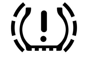 Thanks to the Systemic that sent this my way (whom I forgot to write down who it was, sorry!)
Here’s a great article about the recent addition of the tire pressure emergency light to dashboards, and how nobody gets what the hell it’s supposed to be. Looks like a butt’s force field to me, what do you see? Do You Know What This Symbol Means?- Yahoo! Autos Article Page
See More Posts About:
- A link to this post:
- Tweet
- StumbleUpon
A Big-Ass Mad Men Post
I’m sure it should come as no surprise that as a big fan of design, I’m a big fan of Mad Men. It is an amazing show. I’ve taken some flak for this in the past, with Gary “Fleen” Tyrell saying about my blog:
So here’s one big-ass post to gear up for the season opener just 10 days away.
Everything Don Draper Said
Ever read Unlikely Words? It’s a great blog by the one-time Kottke guest blogger (it’s how I found him) Aaron Cohen. He put together a list of everything Don Draper has said in Mad Men. If you think he was eloquent before, taking out the surrounding dialogue starts to treat it more like Garfield Minus Garfield. It works in a totally different way. A sample:
“Don’t get up.”
“Don’t let me interrupt.”
“You’ll have take radio the way it is.”
“During the Depression I saw somebody throw a loaf of bread off the back of a truck. It was more dignified.”
“Campbell, did you tell him who this idiot’s father is?”
“Horace, Sr is connected to Bert Cooper in a million ways and I don’t know if he would like what just happened in there.”
“Well, there you have it.”
“Has anybody been outside, do I need a coat?”
It’s good stuff. There’s all that and more, here.
Some Awesome Mad Men Posters

I needn’t say anything more. LINK »
(Via Kottke.org)
Mad Men Unbuttoned
A site which strives to provide cultural context to Mad Men episodes by showing articles, book covers, excerpts, music, etc. from the time and scenes depicted. Oh and they feature that poster thingy I just linked to above, so there’s that too. LINK »
Mad Men Yourself

Finally, your own Mad Men 60’s style personal character creator. Here’s me, sippin’ coffee and explaining something about girls in underwear. And I’m pretty psyched about it. It’s proabably the coffee. LINK »
Obama Can’t Be Wrong (In This Case)
And of course our own president is looking forward to the new season.
…after finishing the third season he sent the show’s creator, Matt Weiner, a letter. It now hangs outside Weiner’s office, “congratulating me on my and the show’s success,” and to say “he enjoyed Season 3.”
Wonder what TV shows Bush wrote to? Wow, that’s opening up a can of worms, isn’t it? LINK »
Okay, that’s about it! If you’re a fan, feel free to use the comments to discuss your thoughts on the new season. Are you psyched? Are you ready for the awesomeness? I, for one, could not be more excited. And if you’re not caught up, let’s just assume that there’s spoilers in the comments. Catch up already, you’ve had a year.
See More Posts About:
- A link to this post:
- Tweet
- StumbleUpon
Lost Cat / Problems with Designers

Not all designers are perfect. Some try to make a cigar back into something else, if you know what I mean. Here’s a hilarious story about one such case of a woman needing help with a “lost cat” poster, and the designer who “tried” to “help” her. In regards to the poster above:
David,
yeah thats not what I was looking for at all. it looks like a movie and how come the photo of Missy is so small?
ShannonDear Shannon,
It’s a design thing. The cat is lost in the negative space.
Regards, David.
It gets better from there. Thanks to Systemic (and friend) Lisa for sending this my way. READ THE WHOLE THING »
See More Posts About:
- A link to this post:
- Tweet
- StumbleUpon
FedEx Logo Designer Tells All, Likes Arrows

Ever really look at the FedEx logo? Did you ever notice the arrow in between the E and the X? If not, have you had a graphic designer point it out to you at some point?
Either way, it’s there and it’s one of the more well known logos of our time, up there with Apple and IBM. The Sneeze interviewed the designer of the FedEx logo (Lindon Leader) a while back, and I stumbled across it recently. Makes for an interesting read and makes you realize just how much thought goes into just about everything around us. LINK »
Btw as a quick aside, have you read The Sneeze? It’s good. Poke around there. Especially good is this “How To Draw a Face” article.
Feel free to discuss the logo and your thoughts on the article here in the comments. Ever notice the arrow? Like looking at logos? Think Lindon Leader is a genius or was in the right place at the right time? DISCUSS.
See More Posts About:
- A link to this post:
- Tweet
- StumbleUpon
Two Pieces of Typographic Joy
It’s been entirely too long since I posted cool typography links here on the site, so here are two.

The Big Caption is a companion site to The Big Picture. They take whatever the latest “Big Picture” photos are, and add great (and often hilarious) captions to the image. There are some running themes throughout it’s so far short run, such as “Haters Gonna Hate” and “Hipsters Start Your Photocopiers”. All in all a great site that’s fun to look at. My favorite though is probably the most famous so far, “Fuck you, flowers”. Did I post that one before? I can’t remember. Well it’s awesome. LINK »

Music Philosophy is a link I found via my favorite music site, Aurgasm. They take music lyric quotes and make awesome poster-style images out of them. Here’s a clip from one about The Beatles from “We Can Work It Out”. Could you tell? Check out their site, it’s colorful and fun. LINK »
Finally, one piece of business before I wrap up this post. Does anyone actually read these posts? Click on the links? Enjoy what I’m posting? The blog segment has fallen by the wayside lately, and while I do it for my own enjoyment I’m curious if people enjoy it, miss it when it’s not here, etc. Even if you aren’t a frequent commenter on the site, drop me a line via a comment or however else you feel like and let me know if you read these posts. Or conversely, post and let me know if you don’t, though in a bit of a Catch-22 if you don’t you probably won’t read this to see that.
See More Posts About:
- A link to this post:
- Tweet
- StumbleUpon
Comments: